Assignment 4: iN2015

29 07 2009

In less than ten years, every single person and business in Singapore will find the world – and everyday life – transformed by technology.

iN2015 is the blueprint to navigate Singapore’s exhilarating transition into a global city, universally recognised as an enviable synthesis of technology, infrastructure, enterprise and manpower.

It is a living plan that gives every individual and endeavour seamless access to intelligent technology – and with it – the capability to take charge.


in this assignment, we were to create an A3 poster to create awareness/warn the public regarding the iN2015 masterplan.

Brainstorm

i wanted my posters to be very impactful, and something viewers would understand in first glance. generally i went ahead with the idea of reminding the public to keep up with technological developments in order to not be left behind.

i came up with these 2 sketches

image2

in CHOOSE YOUR SIDE i wanted to paint the stark difference between a person who has been left behind, versus a person who has kept in step with development. i thought of using a car to represent and show development, intending to use concept cars to bring out a futuristic feel to the poster. Problems in developing the this poster laid in finding a suitable background to place my concept car in, as futuristic landscapes of Singapore are hard to portray without looking too cartoony.

in CATCH THE WAVE, i thought of the new technological phase as a new “wave” of development, and hence used surfers and waves to portray that need to be with the wave instead of fighting against it. i developed the wave idea into a larger sketch/prototype:

Image

but with this i also had problems creating a futuristic look for the surfer without looking too cartoony, and also photoshopping waves to the angle that i wanted. I wanted the surfer to appear like he’s coming towards the reader while riding the wave, but was unable to find any photographs that had the components of a wave that i wanted.

so i came up with a new thumbnail, something that i thought was simpler and needed less work.

image3

in this, i showed a runner from side profile trying hard to keep up with concept (futuristic) cars, but to no avail. it obviously portrayed the need to keep up physically, and could be used to portray the need to be in line with technological developments iN2015.


Finally done with the final poster:
Print

in this poster, i deviated from previous developmental ideas as i had problems creating waves that looked vaguely realistic, as well as creating a high-tech surfer along with that.
hence, i proceeded in another direction with my poster, aiming to guide viewers to be more ‘forward-looking’ and optimistic about the future, as opposed to the gloomy mood in the previous ideas.

the tagline for this poster is “Find Your Way”, and this is inferred both literally and hypothetically. Literally, the poster can be understood as having a high-tech GPS that allows users to find their way in a futuristic city, something that is appears to be alien and cold (portrayed by cool settings of the buildings). In this sense, what i’m trying to say here is that, even if the future looks appropriately different and scary to some, there are ways to ‘find yourselves’ within. The hypothetical meaning to the poster is a slight warning for viewers to be up-to-date, and not to get left behind in today’s fast-paced technological advancements. Hence, this poster can be read on two levels, depending on the interpretation of the viewer.


Assignment 5 (part 2)

27 07 2009

i re-did my assignment 5 on colours of Asia from scratch.
this time i decided to use dance as something that is representative of Asia, as i myself am a dancer and i feel that dance, like music, of each culture speaks volumes of its history and traditions, as well as the values of each culture.

hence, i picked 4 countries that may represent part of Asia – Thailand, India, Japan and China
my target audience this time is the young adults, and so i played around with several colors and fonts that might speak more to the younger generation:
color (final)

this was the scheme i chose, because i thought the colors were all really bright but vastly different from each other, to showcase the vibrancy and distinctiveness of Asian cultures.
similarly, the font was chosen as i felt it was a more ‘modern’ font, that placed a nice contrast between the traditional (dancer + traditional building), and created a blend between the new and old that fit in nicely.
postcard (final)


Assignment 6: How things work

22 07 2009

“Transformation literally means going beyond your form.” -Wayne Dyer

for this assignment, we are to choose a system and design infographics to explain how that system works, showing developmental processes and stages that are related.
during my brainstorm period i chanced upon a friend’s magazines on toys, featuring transformers figurines in their latest issue. i had the idea then to create an step-by-step instructions manual for the transformation of such figurines, targeted at people who can appreciate the transformation process of the toy but are unable to do so themselves (like yours truly).

so, armed with a borrowed Bumblebee from a friend, i youtubed transformer tutorials online, and spent the next few hours attempting to transform the toy while taking pictures of it at each stage.

Final Prototype
Here is the final prototype; a manual simplified into 8 crucial steps of transformation that will turn a Bumblebee car into a Bumblebee robot.

transformation

Feedback & Action
the class commented that the text in each box was not very obvious and clear (which i have then bolded the words in my final prototype). at the same time, people were not clear of the flow-sequence of the manual, and thus i have added red boxes with numerical values within to indicate the start and the end. I’ve also added a grid structure to the manual to create a more orderly image.


Assignment 5: Your notion of Colorful Asia

20 07 2009

in this assignment we were supposed to create a postcard based on the cultural, political or social aspects of Asia, targeted at anyone whom we wanted to introduce Asia to.
i had quite a lot of problems with this assignment, as i did not have any ideas of where or how to start.
due to the lack of time, i drew ideas/inspiration from my own travel experiences to Asian countries

Brainstorm
i sourced for colorful photos in my collection, and found this photo to be particularly colorful, however ill-complimenting of China it is.
Beijing Mar 04 048
this was taken during a trip to Beijing in 2003, and the colors of the costume really struck out to me.

Prototype & Content
from there, i had an idea to do “Faces of Asia” as my theme, portraying how different cultures and their respective history made up the colors of Asia.

Photobucket
one of my approach was to use masks from different cultures combined in a postcard to portray that colorfulness of history and tradition. i am definitely not satisfied with this piece of work, but given time constraints i had to work with whatever i could to come up with something to present. the masks i used above represent traditions from different cultures, such as China, Cambodia, Indonesia etc, and the vibrant colors present within each mask also symbolizes how colorful and rich Asia’s history is. I used the Great Wall of China as a background to these masks because i thought that the Great Wall was one of Asian’s top pride, with it being one of the 8 World Wonder, and being visible from space and all that jazz. It is representative of Asia’s deepset history, making Asia very interesting and vibrant.

Feedback
feedback from the class was that the postcard was too ‘fixed’, that it did not give space for the exploration of different color templates. also, Zhixiong mentioned that using the Great Wall as my background gives the impression that all the masks were derived from Chinese history instead of from multiple cultures. Suggestions were given to present the masks within a grid to create a more structured approach to it.

I’ll definitely take into consideration the feedback. Most likely will be redoing this assignment as i’m really displeased with the final work.


Class Assignment C

20 07 2009

the task in this class assignment C was to use basic elements (dot, line, shape…) to create2 abstract / semi‐abstract images conveying the meaning of these words.

i picked the words “PEACE” and “POWER”

peace2
i chose the dove to represent peace because its a universal symbol of peace, directly related to the story of Noah’s ark and how he let out a dove that returned with an olive branch in its beak to indicate the end of a violent storm. this symbol is universally recognized – to the ancient Chinese it was a symbol of long life and peace; and the Egyptians held the dove to symbolize quiet innocence. i drew a straight horizontal line behind the dove to create a feeling of calmness, an element also related to “Peace”.

power
power, on the other hand, required edgy and sharp lines to depict energy and robust, which i achieved by drawing thorn-like structures emerging from a person’s clenched fist, another icon of strength and power. the red ‘thorns’ were colored red to give a sense of urgency and alarm; something that makes the fist appear more power-packed. the angle of the fist also gives readers the illusion of it coming towards them, increasing the POWER of the image.


Assignment 3 (part 2)

15 07 2009

after taking into consideration the comments given by the class as well as Alfred & Zhixiong, i decided to take out frames 2 & 3 from the previous photo story, and put in two other frames to lighten the mood at the start.

here’s the new “Till Death Do Us Part”

1-1

1

4

4-4

5

6

7

8

changes that i made:
– i took out two pictures from the ‘preparation’ phase from the previous shoot, and put in two new pictures –> the first one of my character acknowledging the date of anniversary, and the second one of him being stumped for choice at a florist

Explanation:
– the first frame was taken in a deliberately casual and slack mood, with my model slouched over, legs crossed on a balcony deck, because i want to create the illusion of him being lazy about the anniversary, or seeing it as just another day
– the fourth frame was taken at a florist’s; the idea was for the character to appear stumped for choice, portrayed by the overwhelming and strong colors of flowers, as well as the array of selection available. this makes the character seem slightly out of place, as he’s in all black, and makes him stand out. also, in this shot, the character is actually looking straight at a bunch of roses at the back of the room, to create an implied direction/line. however, after refocusing and adjusting the light to create a focus on the character, the roses became not-so-visible. so thats a problem that i faced in the process.


Assignment 3: U C What I C

9 07 2009

“Love is stronger than death even though it can’t stop death from happening, but no matter how hard death tries it can’t separate people from love. It can’t take away our memories either. In the end, life is stronger than death.”


for this assignment, our task was to communicate a story through 8 photographs
i’m not usually a very morbid person, nor do i particularly enjoy morbid situations; but in this assignment i decided to explore a story of love twisted with a tinge of morbidity to evoke certain emotions and reactions from my audience.

Below is my picture story: Till death do us part

1

2

3

4

5

6

7

8

the story is pretty ambiguous in a lot of ways, which is what i wanted in a sense because there are many storylines that can be conjured from a viewer’s imagination by looking at these photographs. there wasn’t enough space for me to develop the characters even more, but what i had in mind was a man who killed himself on the anniversary of his relationship with a woman he loved; romantic morbidity. he appears to be preparing for a date in the first 5 frames, suiting up and ‘writing’ a love note prepared with roses. The first twist appears in frame #6, where he appears with flowers&note at a grave, while the second twist comes in the subsequent frame where he kills himself in front of the grave. In the last frame, the intention was for the love note to explain the story, with mentions of ‘anniversary’. The late-girlfriend signed off the note with “I’ll love you till death do us part”, in which “do us part” was canceled off by the man, such that the note reads “I’ll love you till death”. The canceling of the note was done in frame 3, under the cover that he was writing the love note itself.

Feedback from the class was that the last frame wasnt very obvious in tying in the whole story, as i had to explain the words and its significance before they understood it. Also, suggestions were for the second last frame to be of non-suicidal nature, such that the last frame would have an increased impact, with its blood and knife in view. In addition, Zhixiong felt that the first 5 frames were advertising the suit/shoes too much; and that i should include a frame whereby my character buys flower from a shop, or something to that nature to minimize the ‘advertisement effect’. I’ll look into making those changes as soon as i can.

Lastly, i just want to give credit to my crew, without whom my photoshoot would not have gone through so successfully.

9
My crew consisted of my technical assistant (in green), Zhenjie, and my model (in the shirt), Macarthur, who rendered me great help and patience as i retook shot after shot till satisfaction. We also visited the grave in hot afternoon sun to do the last few frames, even though it was Mac’s birthday, and I am eternally thankful for his willingness and patience to do so. I am blessed to have such wonderful friends; they made all these possible.


Assignment 2: Less is more

6 07 2009

in ‘less is more’, we were required to create ONE pictogram through an abstraction process that simplifies a picture into a signifier.

Brainstorm
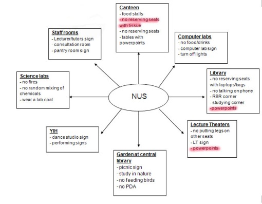
as the signifier was supposed to be placed somewhere within NUS, i did a mindmap of places where these signs could be placed

map
from the mindmap, i picked two types of signs that might work for this assignment:
1) a sign to indicate the locations of powerpoint outlets
2) a sign to prohibit the reservation of seats in the canteen using packets of tissue paper

Sign #1 – POWERPOINT
i started with the easier of the two – the Powerpoint.
this idea came from my frustration at the inability to spot powerpoint locations in proposed study areas in school, such as the Central Library, or the study lounge in YIH, or in canteens, especially during study periods. powerpoint outlets are usually hidden behind furnitures such as tables, chairs or other placements that obscure its location from users. personally, i felt that a visible sign placed at eye-level would aid in the hunt for these powerpoint outlets.

here’s my 5-step reduction process of a photo i tookplug completein this pictogram, i placed the plug next to the power socket to indicate a functional powerpoint outlet. i had some problems tracing the power socket due to my lack of illustrator skills, so i hand-traced the picture and scanned it in. i abstracted it in 5 steps, and picked the last one as the final abstraction step, as the three black rectangles are surprisingly representative of the power socket holes.

Feedback
comments given by Mr Low and the class was that the picture was too simplistic for abstraction, and although Mr Low mentioned he could see the process of abstraction being done, there wasnt much of a point in this case. Feedback was given that the powerpoint could have been simplified to just the three black dots that represented the socket, and it kinda defeated the purpose of this abstraction process 😦

Sign #2 – NO TISSUE RESERVATION OF SEATS
tissue not complete
this idea was inspired by the trend of how Singaporeans ‘chope’ seats in the canteen with packets of tissue papers, and the idea was to request people not to reserve seats in school canteens due to overwhelming population during peak periods. however, i was stuck after the 2nd abstraction, because i had a problem with how the 3 images did not look like someone was reserving seats, and looked more like someone was running away from tissue paper. Mr Low commented that this idea was a lot more interesting than powerpoints, and i will look into developing this idea.

Others
on a random note, after going through the class on semiotics and readings on pictograms, i’ve been noticing the signs around me a lot more than before. on sunday, after a church service at Kuo Chuan Secondary School, i noticed this sign that looked a little odd
P1040954

although instinctively this looked like a “Do Not Litter” Sign, the msg i got from the sign was “Do Not Throw Your Litter in the Thrash”. the No-symbol, to me, serves to negate the purpose of whatever is depicted behind it, and in this case negates NOT-littering. would have been better if there were litter being thrown around by Mr Stickman instead of a thrashcan there.

just my two cents worth (:


Assignment 1 (part 3)

4 07 2009

i saw some snake pictures on National Geographic the other day, and decided to try a pictorial design with my snake idea, with some encouragement from friends who liked the thumbnail that i came up with.
i went online to look for some pictures of snakes, and found a few that i really liked, such as these:

1141271_14949691
489006_62846749

from my compilation of snake pictures i used photoshop to tweak the angles and colors of the snakes, and created a picture of snakes hanging in the shape of my name
snkjoy

however, feedback from the friends that i showed this to was that it looked very artificial and forced, and very ‘obviously photoshopped’. i havent yet decided which to use for my final submission, but this obviously needs more work if i were to choose it i reckon.


Assignment 1 (Part 2)

2 07 2009

i am a photoshop/illustrator illiterate. however, after a few days of watching online tutorials, frantic F1-help queries, and help from generous friends, i present… the prototype for Assignment 1: the JOY of skiing.
ski (upload)

i made a few changes to the prototype from the full-size sketch: i added crevices/shadows to the mountain body to create a more realistic image of the mountain; and created a shadow mountain behind the peaks of the JOY-mountain to add a slight 3D view to the whole picture. The mountain shadow was, however, given the no-no by the class and Zhixiong, as it was said to reduce the visibility of the letter “Y” and take away the focus from my name. The random skiier and snowboarder at the bottom of the mountain got some positive screen time in the presentation on the other hand, with the class commenting that it completed the whole picture instead of leaving the mountain bare.

on the topic of skiing, i decided to upload a few photos from my past skiing trips.
the most recent trip was to the Münich, Germany, to a ski resort by Garmisch Parten-Kirschen in December last year
germany-ski

and this was taken in Melbourne, Australia, last year July. gotta love the southern hemisphere when aircons dont cut itmelb - ski

skiing in Hokkaido, Japan is in the books this December, and i’m so so excited! it’s one of the tougher places i’ve ever been to ski though, where “Beginner” really means “You’re already very good”, and “steep slope ahead” really means “get ready to roll”.